

Predictive Voice AI Companion
Duration
Jan 2024-Aug 2024
Location
Berkeley, CA
Advised by
Apple Siri Expert (Senior)
Task
Voice Interaction
VUI Design

Branding for the night thinkers
Lunaria is a brand identity created for a boutique product rooted in mindfulness, luxury, and introspection. Inspired by the moonflower plant (Lunaria) and desert nightscapes, the brand needed to feel premium yet soft, mysterious yet clear — speaking to those who find power in calm.
Design Approach
Minimalism meets mysticism
The identity is anchored by a custom logomark inspired by the Lunaria seedpod — delicate, circular, and symbolic. We paired it with a clean serif wordmark and a desaturated color palette of moonlit purples, desert neutrals, and charcoal black. Typography balances contrast and elegance: sharp serifs for titles, neutral grotesques for body copy.
We also introduced a set of soft-glow textures, organic linework, and icons that extend the visual system across print and digital formats.
Design highlights:
– Refined logomark based on natural symmetry
– Custom texture library for background depth
– Modular visual system for packaging, web, and social
Brand Essence Exploration
Harmony empowers dementia relatives with AI-powered voice biomarkers to enable early detection and personalized, accessible, and trusted care.
We began with strategy sessions around keywords, color psychology, and market positioning. Together with the client, we defined the core mood: lunar calm, grounded mysticism, and premium restraint. This became the emotional foundation for all visual exploration.
Key challenge 1
Low stickiness for periodic health check
Early testing showed that abstract agents left middle-aged users feeling detached and unsure how to engage — making daily check-ins easy to skip.
To make the experience feel more personal and inviting, I introduced a character-based conversation agent that fostered emotional connection and routine. By generating daily topics from iPhone Health data and adding expressive response animations, the experience felt more natural, engaging, and habit-forming.
Key challenge 2
High anxiety when viewing medical report
Ideation:
Designed the report flow with focus on emotional clarity and actionability.
Instead of raw scores, descriptive language and a “Confidence Badge” build trust without panic.
Progressive disclosure softens medical terminology, and clear, actionable suggestions turn results into a feedback loop rather than a one-off test.
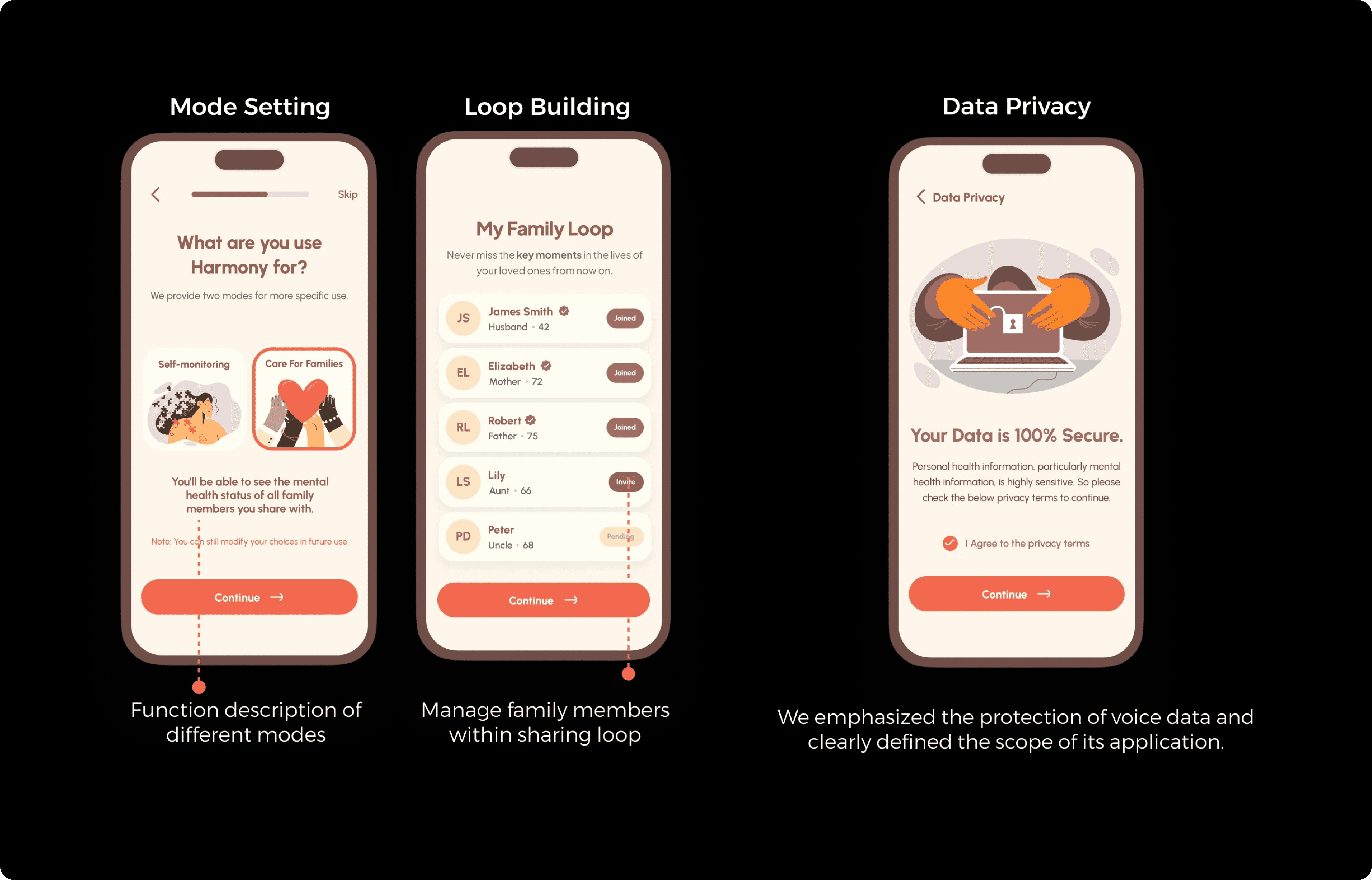
Key challenge 3
Multiple stakeholder modes and data privacy tension
Unclear information presentation led to confusion about data boundaries and control. Caregivers were unsure what they could access, while users worried about oversharing.
To address this, I refined the interface to make data visibility and consent states explicit. Clear visual hierarchy, mode labels, and consent cues helped distinguish personal, family, and hospital access — reducing confusion and building user trust.

Open Testing
10+ Usability testings clarify iteration direction
We tested the prototype with over 10 participants at a public pitch event. This group included caregivers, middle-aged adults, and medical stakeholders. Instead of just observing usability, I wanted to understand their emotional reactions to this new kind of health interaction.
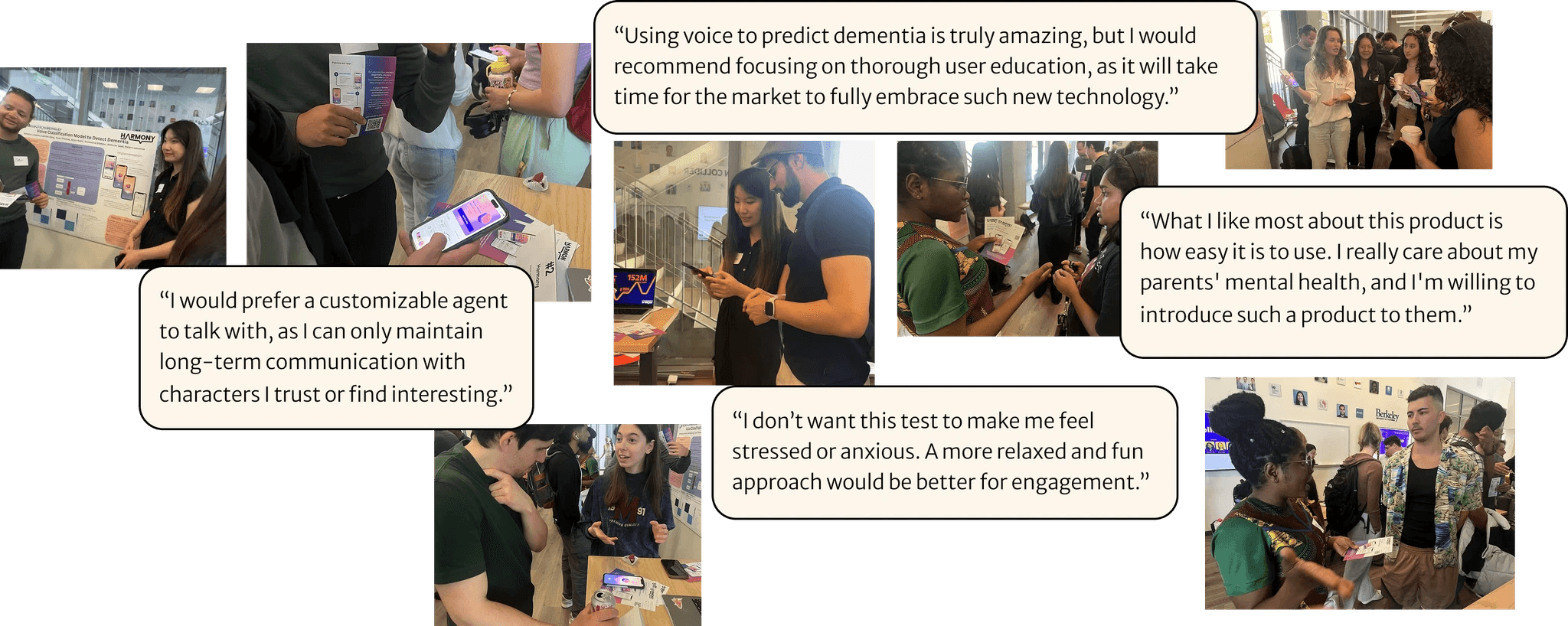
Critical findings:
Low engagement in periodic tracking: Many users expressed that while the app felt approachable, it didn’t yet create strong motivation or cues to build a consistent routine.
Anxiety peaked during results reporting: Participants felt tense when receiving health feedback, worrying about interpretation and implications.
Lack of clarity in data transparency and caregiver visibility: Users were unsure how their data was stored or shared, and caregivers wanted clearer ways to access and manage family information.